
 UPLOAD FILES
Trade Show Stand Design Ideas: How to Maximize Impact Without Overcomplicating Your Booth
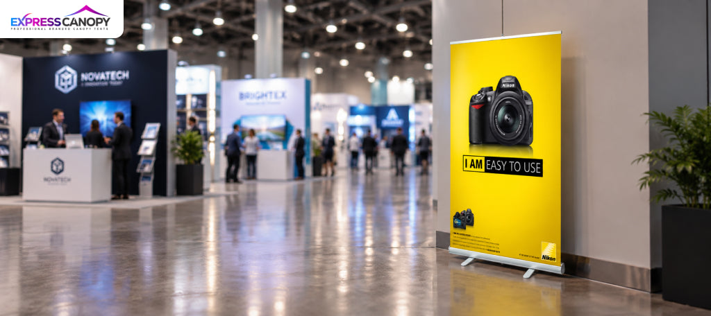
Good trade show stand design is not about adding more. It is about giving every part of your booth one clear job. A booth with fewer, well-placed elements is easier to understand, easier to walk into, and easier to remember.
A strong stand helps visitors answer four questions in a few seconds:
-
Who is this brand?
-
What do they offer?
-
Why should I stop?
-
What should I do next?
Below are 10 simple design ideas, a guide for each booth size, and a checklist to use before you order anything.
What Is Trade Show Stand Design
Trade show stand design (also called exhibition stand design or trade show booth design) is planning how your booth looks and works. It covers your booth layout, booth branding, booth graphics, displays, booth furniture, and visitor flow.
Good design balances brand visibility + visitor flow + clear messaging + function.
Start With Your Stand's Main Goal
Decide your goal first. A demo booth looks different from a lead-collection booth.
Common goals include getting leads, launching a product, building awareness, and booking sales meetings. Then follow this order: Goal → Audience → Message → Layout → Displays. Don't design the stand first and find its purpose later.
Trade Show Stand Design Ideas That Keep Things Simple
1. Create One Clear Focal Point
Give visitors one thing to look at first. This could be a branded backwall, a big headline, or a product demo. When three things compete for attention, visitors don't know where to look, so they often keep walking.
2. Use a Simple Visual Hierarchy
Guide the eye in this order: Brand → Message → Offer → Action.
-
Largest: your brand or main message
-
Medium: your key benefit
-
Smaller: supporting details
-
Clear and visible: your next step, like "Book a demo"
3. Keep the Message Short
Good booth messaging is short. People walk past quickly, and paragraphs don't get read. Say what you do, who it is for, and the main benefit. Let your staff explain the rest. Your trade show graphics should start conversations, not replace them.
4. Leave the Entrance Open
Don't put a table across the front of your booth. It feels like a wall. Keep the front open, keep sightlines clear, and place furniture to the sides or back. This matters most in small booths.
5. Use Vertical Space
Before you add more floor furniture, look up. Tall backwalls, banner stands, and hanging booth signage (where the venue allows it) show your brand above the crowd while keeping the floor free.
6. Design Around Visitor Flow
Plan the path visitors take: Notice → Approach → Enter → Explore → Interact → Act. Put branding where people in the aisle can see it, products just inside, the counter and lead capture further in, and storage out of sight.
7. Use One Brand System
Use the same colors, logo placement, fonts, and image style on every piece. A simple booth still looks strongly branded when everything matches. Mixing many colors and messages makes even a big booth look messy.
8. Give Every Element a Job
Use this test: if an item doesn't help attract, inform, demonstrate, engage, or convert, remove it. Apply it to tables, chairs, screens, brochures, signs, and giveaways.
9. Build a Small Conversation Area
If your goal is sales talks, give people a place to talk. A small counter like our podium and counter displays, a standing area, or compact seating works well. Don't block the entrance just to add chairs.
10. Plan Your Storage
Boxes, bags, and extra brochures can make a good booth look messy fast. Plan where they will go before the show. A fitted custom table cover hides storage under the table and adds branding at the same time.
Simple Trade Show Booth Design: Less Can Do More
Simple trade show booth design does not mean boring. A simple booth can still be branded, professional, and memorable.
Use this formula: one focal point + one core message + a clear visitor path + only the displays you need + a visible call to action.
|
Overcomplicated |
Simpler |
|
Many competing messages |
One main message |
|
Too many graphics |
Focused branding |
|
Furniture everywhere |
Only useful furniture |
|
Products on every surface |
A few key products |
|
Blocked entrance |
Open visitor path |
|
Too much text |
Short, clear message |
|
Mixed displays |
One matching display system |
How to Design for Different Booth Sizes
The same ideas work for any booth size. Always check your event's exhibitor manual for size, height, and layout rules, because they change from show to show.
Small booth: Focus on vertical branding, an open entrance, one focal display, a small counter, and very little furniture. 10ft trade show displays are made for a standard small booth.
Medium booth: Add a product zone, a demo area, and a conversation space.
Large booth: You may include several product areas, a meeting space, a reception counter, and more storage. Keep one main message so the booth still feels connected.
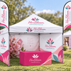
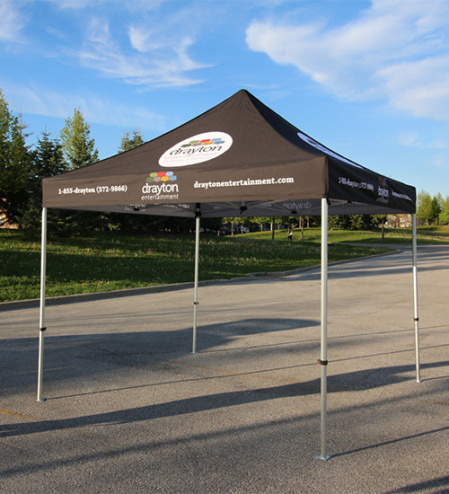
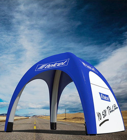
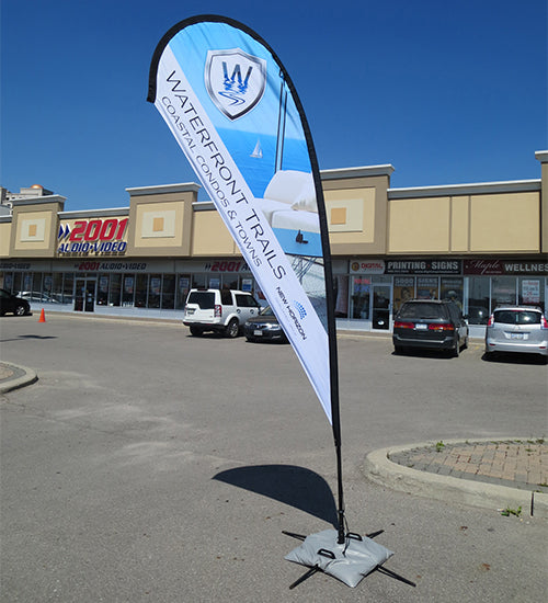
For outdoor events, a custom canopy tent gives you overhead branding and a clear booth outline. Add walls from our canopy tent accessories for a branded backdrop, and use custom feather flags so people can find you from a distance.
Design Your Stand Around the Visitor Journey
Visitors decide quickly in a busy hall. Design your booth to pass five simple checks:
-
Recognition: Can they tell who you are?
-
Relevance: Can they tell what you offer?
-
Interest: Is there a reason to stop?
-
Engagement: Can they easily talk to someone or try something?
-
Action: Is the next step clear?
Use Lighting to Support the Design
Use lighting to make graphics easy to read and to highlight key products or demos. Light should point to what matters, not decorate.
Choose Displays Based on Your Goal
Pick each trade show display because it solves a problem, not just because it is available.
-
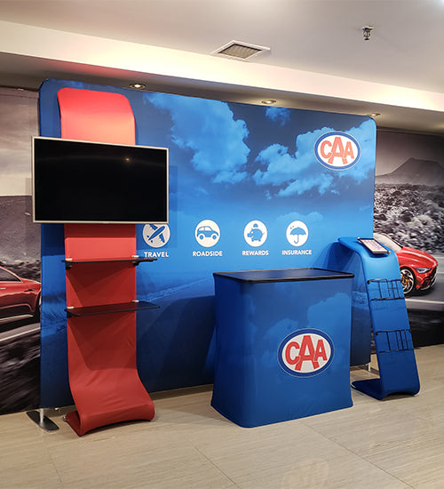
Backwall or tension fabric display: a strong focal point that is light and easy to pack
-
Counter: a place to talk and collect leads
-
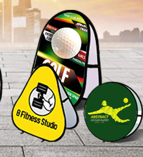
Banner stand: extra height and visibility
-
Canopy: shade and overhead branding outdoors
-
Branded table cover: hidden storage and a clean look
Common Trade Show Stand Design Mistakes
-
Too much text: visitors skip it and miss your message.
-
Competing messages: people can't tell what you do.
-
Blocked entrance: the booth feels closed.
-
Too much furniture: there is no room to walk or talk.
-
Mixed colors and fonts: the brand looks weak.
-
Cluttered product display: your best product gets lost.
-
No storage plan: boxes end up in view.
-
No staff space: staff block the entrance.
-
Ignoring setup and transport: the design is hard to build or ship.
-
Skipping venue rules: you may have to change your booth on site.
Trade Show Stand Design Checklist
-
☐ Set your main goal
-
☐ Know your target visitor
-
☐ Write one core message
-
☐ Set your visual hierarchy
-
☐ Choose one focal point
-
☐ Plan visitor flow and keep the entrance open
-
☐ Pick only the products and displays you need
-
☐ Plan storage and staff space
-
☐ Confirm booth size and event rules
-
☐ Check setup and transport needs
-
☐ Review the design as a visitor would
Design Your Trade Show Stand Around Your Goals
Before you choose displays, think about your booth size, branding, visitor flow, display needs, setup, and transport. Then pick the pieces that fit.
Express Canopy offers pop-up displays, fabric backwalls, counters, banner stands, custom canopies, table covers, and flags that work together as one setup. Contact our team with your booth size and goal, and we will help you build a simple stand that makes an impact.
FAQs
What makes a good trade show stand design?
A good trade show stand design makes your brand easy to recognize, your message easy to understand, the space easy to walk through, and the next step easy to take.
How can I make a simple trade show booth look professional?
Use one matching brand system, one clear message, clean graphics, and hidden storage.
How do you maximize a small trade show booth?
Use vertical space, keep the entrance open, choose one focal display, and use as little furniture as possible.